


Lesson 1 – Content Organization
Overstuffing your website is the most common mistake that both experienced and novice website owners make. People are often afraid to leave things out, so they try to put everything into their websites.
When you have too much content, your core message often gets lost in the clutter. Instead of giving your audiences concise and relevant information, you start to confuse them with data overload.
Your audience will eventually lose interest and leave your website. It is hard enough to get audiences on to your website, so it is important to create a website that will encourage them to stay and absorb your content, and keep them coming back for more!
But I Have a Lot of Information to Share!
The key to an easy to read website is through content organization and layout organization.
* Content organization– how you arrange your content to make it easy to absorb / understand
* Layout organization – how content is arranged in your site so it is easy to read
We’ll go over Layout Organization in our next tutorial, and we will focus on Content Organization today.
As a general rule of thumb, you should take a step back and look at your website from a high level perspective and follow the following 2 principles:
1) Make everything count, or get rid of it (Trim the fat!)
2) Create Content Hierarchy
1) Trim the Fat
Make everything count, or get rid of it:
1) Trim things that are not needed
2) One message, one action
The first step to content organization is to trim the fat. This should be your new motto: “Make everything count, or get rid of it.”
People’s attention span is naturally short – this is especially true in the online world as people are just 1 single click from leaving your website without feeling rude.
On average, a person will give you 1 – 5 seconds to make your first impression. If they don’t find what they need in the brief initial visit to your website, they will leave.
1 – 5 seconds is not a lot of time, so you have to present your most important / critical message to convince them to stay on your website.
A successful website can easily answer these two questions:
1) How can your website help me?
2) If so, where should I click next?
Let’s face it, people surf the internet to find information or get help. So you need to make it very obvious how you and your website can help, and avoid confusing your visitors with too many options. Only add in content that can help you guide your visitor to do what you want them to do. Do not attempt to fit too much information on a single page.
A very focused, headline explaining in one or two short sentences how you can help will do the job. Your main goal here is to grab your readers’ interest so they will give you a chance and remain on your website.
Question 1 – How Can Your Website Help Me?
Ask a family member or a friend to look at your website (especially your home page) and see if they can answer this question by looking at it for 3 seconds: How can your website help me?
If they can’t figure out how your website can help, then you’ll have to improve it. Your headline (especially on your home page) must be able to tell people what your website is all about, and how the visitor can benefit from it.
Question 2 – Where Should I Go Next?
Next, look at your website and see where it helps to answer this question: where should I click next? This can be a button, a linked text or anything that calls for an action to move forward.
Anything left over from this exercise is fat. Go through these “fat” and see if they truly help you emphasize your website’s purpose, or are they just “nice to have”. Eliminate anything that’s “nice to have” and does not reinforce the 1-2 core messages your want to deliver.
CASE STUDY
This is a very typical DIY website.
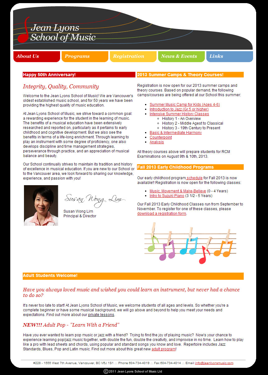
Our initial impression of the site is there is a lot of information, and there is no single consistent message that tells how they can help me, why I should stay and whether their service is right for me.
From the overall theme, I can tell it is a music school. I can see they have different events coming up, but overall there really aren’t any headline benefits or calls to action that catches for my attention.
If you are a parent and want to enrol your children into a music school, do you think this website has what it takes to grab your attention in a few seconds and really convince you that you should invest your time to finding out more?
Where is the core message? Where is the answer to my problem? Why should I consider this music school versus all the other musical schools out there?
Website After Applying Organization Principles
We took some time to search through the website and re-constructed the homepage based on the principles we discussed.
We first identified the key selling points or the core messages of the music school, which include their rich heritage / history and their excellent music programs. When choosing a music school for your children, you will consider how the school can help your children become successful.
So we highlighted 3 key points:
1) Interactive programs that develop creativity and appreciation for music
2) Heritage of the school and the prestige of the founder
3) Achievements of the past and current students (to show that the program works!)
Collectively this answers our first question: How can your website help me?
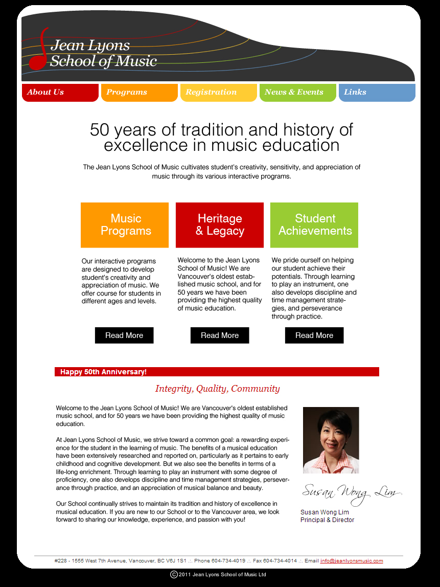
To answer our next question: Where should I click next?
We created three distinct columns to display the 3 key messages.
We then inserted a short summary to describe each of the 3 key points in more detail so to create a natural reading progression. Finally we added “read more” buttons for the website visitor to continue to get more relevant information.
Trimming More Fat
There is still have a lot of content left over that was part of the original homepage design. We now need to review the remaining content to trim down the fat.
We decide to keep the “Happy 50th anniversary” post since it helps to emphasize the history and prestige we are trying to communicate.
However, we removed the summer courses and adult courses posts from the homepage. Remember, we want to create a single unified message on the page. We already introduced 3 key points, so there is no need to overwhelm the visitor on more messages, and start to depart from the core messages.
The summer and adult courses should she placed under “Music Programs” category. When people click into “Music Programs” they will be able to see the featured summer and adult courses.
Just by studying and focusing on the key values that the music school offers to parents and students, and by answering the question “how can this website help me”, we have successfully re-designed the website and make it easier for visitors to:
1) Understand the purpose of the website by emphasizing the important messages
2) Focus on core messages by taking out unnecessary / non-core distractions
This re-arrangement of content can be easily done with Weebly’s drag and drop elements. The key is quickly and effectively demonstrate to your visitors how your website can help, and why they should stay.
Action Points:
Study the main pages of your website (at least your home page) and ask these questions:
* Do I have a clear, concise headline that can effectively communicate how my website can help solve a problem(s) or what my website is all about in a few short seconds?
* Do I have a clear “next step” path so I can guide my visitors to the relevant section so they can get relevant information?
* Do I have any “nice to have” information cluttering up my home or key pages that can distract my visitors?
2) Create Content Hierarchy
The second step to creating a more legible (easier to read) website is with Content Hierarchy.
It’s really quite interesting how once you make your website more “readable”, it magically becomes better looking (better design). Difficult to read webpages equals confusion. Confusion is from poor design.
To fix this, let’s understand how people read websites.
The truth is, most people scan content on websites. When they find something worth reading, they will slow down and invest the time to read the complete content.
An overstuffed website or a website that doesn’t have hierarchy makes scanning very difficult. As a result, your visitors will need to work hard to sift through your pages to find what they need.
In reality, a very low percentage of visitors are willing to take the extra effort to understand your content. Most people will just leave and search for other websites that can give them what they need without making them work for it.
Content hierarchy is an effective way to help your visitors work less.
Think of common publications such as newspapers, magazines and journals. These publications deliver tons of information, but you never get frustrated or overwhelmed by them.
The key is how they organize and present their content to make it easy for you to read and absorb.
Follow this simple structure to make your content easier to absorb:
1) Start by placing the conclusion as your headline
2) Follow up with key points
3) Finish off with the details
This enables your visitors to scan for interesting content without having to read through a lot of text. This will encourage them to stay on your site longer as it won’t be too much work for them to find what’s relevant to what they want to read.
This can help improve your visitors’ experiences on your website, and cultivate loyalty.
CASE STUDY
The following is a very typical “About Us” page. Although the content is very interesting, it’s not easy to scan through and get meaningful information from it, without investing time to read through the entire page.
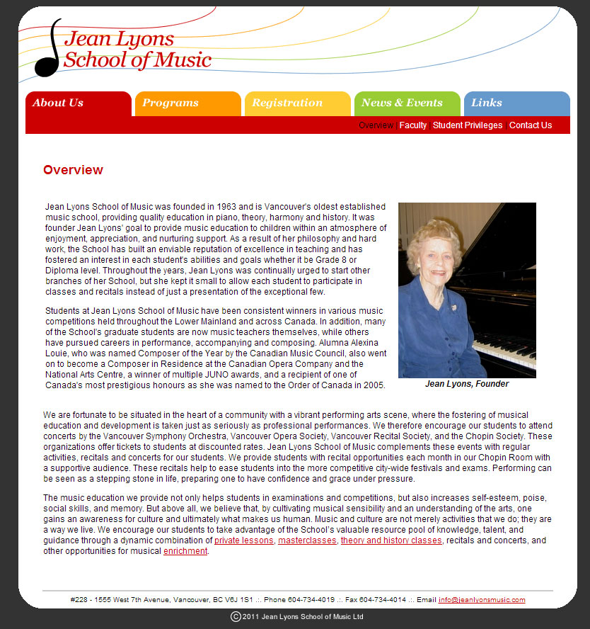
We spent some time to read this page and identified the key highlights of the content. This is a lot of time that an audience should NOT spend. It is the job of the website owner to make this as simple and reader friendly as possible.
We reconstructed the about page based on some of the key points on the page:
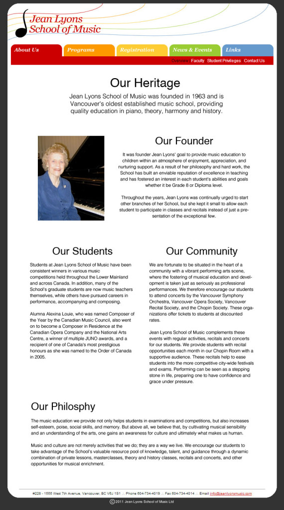
With the new version, it’s so much easier and less work to pick up the critical points of the page.
We separated the long article into concise, digestible chunks of text. We employed the top down approach where we start with the conclusion or headline first. Instantly you know the school has a long standing heritage and it is the oldest established music school in the city of Vancouver.
We then followed up by highlighting key points in the form of titles, and finished off by including detailed descriptions below the titles.
You can now quickly scan through the page and understand that this page talks about the school’s heritage, founder, students, community and teaching philosophy – all without having to invest a lot of time and effort into reading.
By simply re-arranging the order of your content, the impact is quite significant from design and user experience perspectives. You don’t have to be a “born” designer to do this at all!
Action Points:
Go through all of your webpages (if you have a lot, at least the key pages):
* See if each page looks overwhelming or crowded
* Try to employ our recommended structure (conclusive headline – key points – details) to simplify the pages to make them easier to scan
* If you have a hard time re-structuring your page, summarize the entire page in 1 single sentence, and insert this sentence as your headline for the page. This will be a good starting point.
For Tomorrow
We’ll be going over layout organization tomorrow to highlight a few effective, and simple to implement techniques on how you can create a better layout for your pages.
By doing this, you will automatically improve your overall website design! We will also include a case study to show you how small changes can yield huge results.
See you tomorrow!
Jeremy & Connie