


Lesson 3 – Add Personality Using Color
Believe it or not, your website is an extensive or expression of you, your company and/or your organization.
The difficult part is that trying to convey your message, creating a brand and reputation on the online world is much more difficult than in the physical, offline world. This is mainly because you are not there to talk and verbally communicate to your website visitors about what you are all about, and the ideas behind what you are trying to represent through the website.
You have to rely extensively on your website to communicate these, which is often challenging, but critical to your website’s success! Website that fails to create a personality can create a negative tone on your brand, company or organization.
Most people (experienced or new website builders) make the common mistake of simply inserting mediocre images and text without thinking through what impression these tools are aiming to communicate.
In this design tutorial, we’ll show you how to enhance your website’s personality, and build a stronger brand through 3 tools:
1) Color
2) Image
3) Typeface
Whether you are a freelance designer or a brick-and-mortar bike retailer, creating a brand is critical and essential to your business.
We’ll be discussing Color today, and we’ll go deep into Image and Typeface tomorrow!
Why Does Color Matter? How Can Picking the Right Color Help Me?
Choosing an effective color for your website should not be an act of just picking your own personal favorite color. Let us explain.
Each color actually has its own meanings. They convey different message and branding, and therefore, personality. A good website design effectively uses color to strengthen your message.
Most people never think of color has a big influencer of branding, but it is! (We’ll have examples below). You see, color works in a very subtle, subconscious way. It’s almost like brainwashing.
When you see a color of a particular brand / product, the meaning of the color and how it is associated with the brand doesn’t always jump into the front of your mind. Rather, it is slowly working into your brain and affecting the way you feel about the brand / product. This will alter the way you perceive brand by impacting your emotions.
Yes, sounds very “fluffy” but we’ll get into examples below.
Using color is often a daunting task because it seems so elusive. Instead of thinking of color as a design element, think about it as a tool.
Using color on your website is very much like picking your outfit for an event. You will pick a tuxedo for a black tie event and a swimsuit for a day on the beach. There is no mystery about it – you just pick the right type of outfit to the suit the purpose.
This principle is the same for color – you pick the right color that will showcase the purpose and brand of your website (we’ll go over the meaning of color below with examples).
3 Common Mistakes on Picking Colors
The common reasons why people make these mistakes include (1) they don’t fully understand or did not spend the time to define their own identity, and (2) they don’t understand which color(s) can help them communicate their identities to their own audience.
Most people make 3 common mistakes when creating their websites:
1) Using color(s) that do not represent meaning(s) they are trying to portray
2) Using color(s) that contradicts the impression the are trying to make
3) Using color(s) that do not complement each other
So how can you combat that in your website design? You have to clearly define your identity.
Define your Identity
Not knowing your website’s identity and purpose is the same as getting dressed blind, and not knowing what event you are going to. So you end up wearing a bunny costume to a formal wedding. This may be what your website is going through right now!
Before choosing a color scheme for your site, first think about what your website (you, your organization/company) represents.
Are you a corporation, professional or a business that targets business clients? If so, should you need to exude professionalism and trustworthiness? Are you a photographer or an artist who wants to display your design style? Are you a music school with history, heritage and prestige and does that show in your online presence? Or are you an eco-friendly arts & craft online store that wants to represent creativity and sustainability?
Most people don’t take the time to go through this process of defining his/her company or organization. This is one of the main differences between how a great designer approach website design and how a novice approach website design. So do what the pros do to get professional, desirable results.
So what should you do after you understand what your website represents? Pick the right color scheme to get the job done!
Understanding & Choosing Your Color Scheme
Understanding what color means is not as difficult as you think it may be. Each color has a meaning, so you just need to pick the color that fit your purpose.
Remember color is NOT mysterious, it’s just science. Know what you want to represent, and pick the right color to do the job.
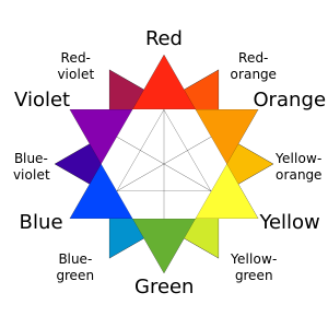
There are 6 basic colors: Red, Orange, Yellow, Green, Blue, and Violet.
There are thousands of color shades, but we will just stick with the basic 6 core colors to keep things simple and actionable. Each color has a meaning that you can exploit to create a visual identity for your website.
In our examples below, look at the website screenshots and really try to absorb the color and allow it to influence how you feel about the branding.
For us, the colors really bring out different emotions and hence affect the way we perceive their brands.
RED (Power / Passion / Energy)
Red is an action color. It represents power, passion and energy.
There are of course, different shades of red. Lighter red is a brighter version of red can give you a more energetic and vibrant feeling, while a darker shade of red represents power and elegance.
You will see red in financial websites as they want to show they are powerful in the finance industry. You may also see a lighter shade of red in designer/photographer’s websites that want to show the vibrancy of the designer/photographer’s design.
Let’s look at some samples:
Darker Red – Power & Elegance
Executive Recruitment Agency

Executive Recruitment Agency
Financial Institution / Bank

Financial Institution / Bank
Holographic Radar Technology

Holographic Radar Technology
Lighter / Brighter Red – Energy & Vitality & Passion
Branding & Design

Branding & Design
Marketing Agency

Marketing Agency
Designer

Designer
ORANGE (Vitality / Progression / Energy)
Orange is associated with vitality, progression and energy. Compared to red, it grabs your attention in a friendlier and more inviting way.
You will see orange in many design websites to show the company’s youthfulness and innovation. You will also see orange in business websites to reveal their friendly and approachable persona.
Brighter orange gives you a fresh, cheerful and friendly feeling. Muted shade orange creates a contemporary and progressive reputation.
Muted Orange – Contemporary, Innovation, Vitality
Branding & Marketing

Branding & Marketing
Non-Profit Physical Health Awareness

Non-Profit Physical Health Awareness
Co-Op Work Space

Co-Op Work Space
Product Designer

Product Designer
Bright Orange – Vitality, Fresh, Approachable
Bank / Financial Institution

Bank / Financial Institution
Veggie Juice

Veggie Juice
Marketing Company

Marketing Company
Fashion Company

Fashion Company
YELLOW (Happiness / Cheerfulness / Creativity / Hope)
Yellow gives you a sense of happiness, cheerfulness, creativity and hope.
Lighter yellow is commonly associated with calmness and happiness, while darker yellow/golden shade gives the sense of decadence and desire. A muted yellow give you an antique and nostalgic appearance.
In website design, you commonly see pale yellow in websites that sells or blogs about household and baby & kids products. Boutique café and designers often use yellow to give a fun and relaxed reputation.
In business websites, yellow is often used to draw attention in a neutral way. Non-profit or charity organizations also use yellow to covey the sense of hope and happiness.
Charity / Non-Profit Organization

Charity / Non-Profit Organization
Local Dry Cleaner uses a muted yellow to create a crafty 50’s vintage look. This give a sense of playfulness & vintage 50’s perfect housewife

Local Dry Cleaner
Graphic Designer showcasing a fun side of design

Graphic Designer
Location Scouting Agency

Location Scouting Agency
Branding & Marketing Agency – fun and creative

Branding & Marketing Agency
Graphic Design Studio

Graphic Design Studio
Photographer

Photographer
Opera Production – Use gold to convey a sense of decadence, richness and desire

Opera Production
Korean Fusion Restaurant – Gold is use here to convey a sense of decadence, richness and desire

Korean Fusion Restaurant
GREEN (Growth / Down-To-Earth / Renewal / Abundance)
Green represents growth, down-to-earth, renewal and abundance.
This is the most versatile color which can represent many different things depending on the shade of green you use. It is a very relatable color that causes people to feel calm when looking at it. We always think of green as a “good” color since it is always associated with nature and sustainability.
Darker shade of green is often used in cooperate or business websites to convey wealth, stability, and affluence in a down-to-earth way.
Brighter and soft green give you a feeling of cheerfulness, vitality, and freshness.
An earthier, olive green represent sustainability, nature and growth. You can see websites that takes about recycling, eco product or want to associate themselves with sustainability often use an earthly green.
Dark Green – Wealth, Stability, Affluence
Financial Institution

Financial Institution
Lectures – Green represent affluence and innovation

Lectures
Eco-friendly homes – Green represent Renewal, Sustainability and Stability

Eco-friendly homes
Earthly Green – Sustainability, Nature and Growth
Fishing Gear Online Store – Outdoor, nature, energy

Fishing Gear Online Store
Coffee – Nature and Growth

Coffee
Brewery – Down-to-Earth, Natural, and Relatable

Brewery
Bright & Soft Green – Cheerfulness, Vitality, and Freshness
Non-Profit Organization Promoting Ethical Companies – Growth, renewal, sustainability, down-to-earth

Non-Profit Organization Promoting Ethical Companies
Café & Restaurant – Freshness, Natural and Energy

Café & Restaurant
Website Design Agency – Freshness, Innovative and Energetic

Website Design Agency
Self Improvement Coaching – Renewal and Growth

Self Improvement Coaching
BLUE (Various Moods)
Blue is one of the most widely used colors in website design because of its flexibility. You can convey a variety of mood, feelings and reputation with various shades of the color.
Lighter blue relates to relaxation and calmness. Brighter blue is energizing and refreshing. Darker blue is commonly used in corporate website since it gives you a sense of strength and reliability.
Dark Blue – Strength & Reliability
Asset Management Company

Asset Management Company
Asset Management Company

Asset Management Company
Luxury Leather Good

Luxury Leather Good
Restaurant

Restaurant
Light / Bright Blue – relaxation and calmness. Brighter blue is energizing and refreshing
HR Recruitment Agency

HR Recruitment Agency
Work Space Management App

Work Space Management App
Child Birth Classes

Child Birth Classes

Branding Agency
Branding Agency
PURPLE/VIOLET (Royalty / Wealth)
Purple is the color of royalty and wealth.
In website designs you often see rich purple representing luxury goods and premium service companies.
Medium and bright purple are often associated with design and creativity. So you will see designers in various field use purple in their website.
Light purples on the other hand resemble romance and spring. So you see pinks and lavender in websites that talks about or sell children products, women fashion and handicrafts.
Dark Purple – Prestige, Luxury
Silver Jewelry– Luxury, wealth and heritage

Silver Jewelry
Luxury Phones – Expensive, wealth and luxury

Luxury Phones
Custom Technology Solution for the Wealthy – Luxury and Exclusivity

Custom Technology Solution for the Wealthy
Bright Purple – Design & Creativity
Art Museum – Design & Creativity

Art Museum

Graphic Designer
Graphic Designer
Branding & Online Marketing Agency

Branding & Online Marketing Agency
Website & Graphic Designer

Website & Graphic Designer
App & Website Developer

App & Website Developer
Graphic Designer

Graphic Designer
Summary & Color Matching Tools
Now that you have a better understanding of what the core 6 colors represent, picking a color to represent what you stand for is one of the easiest ways to inject personality and branding to your website.
You can pair color with naturals like white, black and gray to create a professional website without going overboard.
We know that not everyone is good with picking colors or choosing color palette that complement each other, so here are to really helpful color picker tools that can make your life easier.
Color Picking & Complementary Color Finders:
http://colorschemedesigner.com/
Action Points
Today’s tutorial is pretty extensive but you can break it down into 2 concise steps:
1) Invest a few minutes to consider what you want your website to represent and its identity. Is it power, luxury, passion, energy, progression, vitality, happiness, hope, growth, abundance, stability, relaxation, etc? Figure out the overall feeling you want your visitors to feel, then pick the right color to build your brand.
2) Once you find your primary color, use the 2 color scheme pickers / matchers to find other complementing colors to match your primary color. Use these “secondary” colors to bring out your primary color on your website.
Just by going through this exercise, you can easily and effective build personality and branding into your website.
Remember, people see color in a very subtle, subconscious way. When you see a color, it doesn’t always register right away what it means. But in a very subtle way, the meaning of the color is working its way into how you feel, and perceive a brand. This is why using color properly, is a very powerful tool to build your website.
Tomorrow
As we mentioned at the beginning of this page, color is only 1 of the 3 tools used to influence your brand or personality of your website. Tomorrow, we’ll cover the other 2 tools which include Images and Typeface (mainly font style).
Again, they very simple, effective, and actionable ways to increase personality to your website / brand!
Watch out for our email in your inbox. See you then!
Jeremy & Connie