


Lesson 5 – Crushing Over Design
Over designing a website is actually pretty common amongst the thousands of Weebly websites that we have seen. It’s the opposite of a website that lacks personality – more like a website pumped on steroids!
Time and time again, we see people stuff their websites with too many flashing images, slideshows, widgets, unnecessary paragraphs and images.
When there are so many moving and unnecessary / excessive parts on your website, it really distracts your visitors from the real purpose of your website. Worst yet, if they can’t find what they come to your website for in the first place, they will become frustrated and leave your site.
Recall from a few tutorials ago, it is so important to guide your visitors through your website instead of just dumping dozens of flashing elements and hope one (or something) will catch their interest.
Remember, you only have your visitors’ attention for a few precious seconds (at most) before they decide to click somewhere else. Just think about the way you surf websites. At least for us, the “back” button is probably one of the most clicked button for us!
Organization Refresher
Before we jump into more pointers on how to de-clutter your website from over design, let’s quickly recap what we learned a few days ago about content and layout organization, as they are highly relevant to today’s points:
a) Trim the Fat
Get rid of unnecessary information that is not important to what your visitors are looking for. Think about “what is the main purpose of my website?”
b) Create Clear Content Hierarchy
Start with a very clear, concise headline that tells your visitors what they will expect from reading further. People like to scan for useful content, so grab their attention so they don’t feel like they are wasting their time.
c) Make Your Pages Easy to Read
Use columns, sections, white space and different typography (font types and styles) to make it easy for your visitors to absorb information.
7 Highly Effective Steps to De-Cluttering Your Pages (Help Your Visitors Love You)
Here are 7 highly effective ways to trim out unnecessary distractions and information, so your core message will actually shine through.
Depending on the current state of your website, not all of these steps will be applicable to you. But these are just an aggregate of what we’ve observed across thousands of websites.
Right below the 7 Steps, we’ll show you a case study of an over designed webpage, and how we proposed to clean things up a bit to make it much easier for visitors to find the page useful.
1) Take out any scrolling text and animated banners
Never include page elements that move constantly. Moving images have an overpowering effect on the human peripheral vision. Scrolling and blinking image/text is a thing of the 90’s.
It makes your site look scammy, cheap, outdated, and creates unnecessary distraction and confusion. AVOID THEM AT ALL COST!
2) Limit the use of carousel, sliders, widgets on non-core information
Auto sliding slideshow, carousel and widgets scream for your audience’s attention. They are very useful if applied appropriately.
But when these interactive elements are used to display non-relevant information, they can actually hurt you. It will draw attention away from your core message and focus on things that are not as important.
3) Limit font color to 1-2 key colors
Intense colour attracts the eye, and the greater the area, the stronger the attraction. Too many intense colors attract the eye in too many directions, and the technique loses its potential effectiveness if abused in appropriately.
4) Take out auto-play video or audio
Autoplay is a bad idea not just for accessibility but for usability and general sanity while browsing. Recall how it feels when a very chatty sales person approaches you the instant you set foot into a store. You haven’t even had a chance to look around yet, and the sales person is already trying to sell you a few things.
This is how auto-play feels to your visitors.
5) Do not display content like an advertisement
Selective attention is very powerful, and website visitors have already learned to stop paying attention to any ads that get in the way of their primary goal – looking for information that can help them. (The main exception being text-only search-engine ads.)
This is what we call “banner blindness”. How many times do you even pay attention to advertisement banners across the top, or on the side of random websites you visit?
Studies have shown that less and less people are paying attention to them, as the advertisements, more often than not, have low correlation to what the visitors are looking for (basically not answering or providing a solution of a problem the visitors are trying to solve).
Therefore, it is best to avoid any designs that look like advertisements.
6) Stop writing for Google / Search Engines and start writing for your visitors
You may have seen websites with content that is tailored to try and make the search engines happy. Some people think it helps to stuff many keywords in their paragraphs so search engines will like them more (and help increase ranking in search engine results).
“Keyword-stuffing” is a thing of the past. Google has become a lot more intelligent to differentiate valuable content (to rank higher in search results) versus artificial stuffing of keywords. I think there are currently over 100 different factors that Google considers when ranking your webpages, so just stuffing your page with targeted keywords is very ineffective.
Your visitors will find it very annoying, and so even if you do happen to rank high in search results, if your visitors don’t like your site anyway, this will really work against you.
Think about it, leading websites with a lot of visitors don’t stuff their websites with keywords. They are very pleasant to read, and people keep returning for more.
7) Too many call to actions and no clear path of navigation
When there are tons of links and button that constantly asking you to click this and click that, it creates massive confusion – and frustration. When everything is highlighted, everything starts to blend together (worst yet, hurts your eyes!)
As a result, your visitors will not know where they should go next. In this situation people will most likely decide to leave you site rather than spending any more time and effort to dig through the mess to find what they are looking for.
Case Study of Over Design
This is an example of an over designed website that we saw just a few days ago. Even though it doesn’t hit all the “not-to-do’s” on our list, it has enough to make this a very unpleasant website to visit.
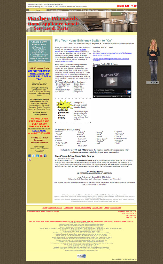
Here are some of our immediate observations:
Annoying Popup Talking Lady
When you first load the site, an intro guide (talking lady on the right) pops up and starts talking about the site. It felt invasive and annoying – this will be especially true if you visited this website while you are at work! We haven’t had time to look around the site yet and we already feel like it is trying to sell me a few things.
Misuse of Attention Grabbing Techniques – Promoting the Wrong Message
Our eyes started to drift to larger, bold colored text about limited offers, “CLICK HERE”, the coupon looking image. Yes, they worked in grabbing our attention, but after spending about 10 – 20 seconds looking at them, we still weren’t sure about how the website can really help us.
If we can’t decide whether we should even start to trust the company, it doesn’t matter how cheap or affordable the services are.
This is a classic misuse of attention grabbing techniques to promote the wrong messages. If we want our appliance fixed, we want someone we can trust and do the job right the first time. Offering special deals and promotions are great, but that’s not our first priority when appliances break (especially a fridge!)
As we mentioned in our previous tutorial, you must highlight how you can help your visitors right away, and your visitors have to “get it” within a few seconds of landing on your page.
Don’t Know What to Do Next – Where Should I Go or Click?
Along the same line as the previous point, there are a lot of links on the home page like “click to contact us”, “click for limited offer”, “appliance repair “ link, video links and more.
Here it starts to confuse people as to where to go, or what to do next. So a lot of times, people get paralyzed and will not click anything at all (worst yet, they will click the “back” button and leave).
In addition, there are so many different phone numbers to call when I looked at the entire webpage. Which one should we call?
It is important to make things simple for your customer – don’t make them jump through hoops!
Keyword Stuffing – Makes Site Looks Scammy
We feel that the site was created trying to stuff a lot of different keywords to try to get search engine’s attention. Due to this, the site looks disorganized and the message of the site is not consistent at all.
There is a lot of redundant content scattered randomly in the site, without a single core message or a value proposition to entice me to continue to explore the site. This is especially true in the footer section – The way the content is presented makes the site not very readable and appears a tad bit scammy.
Even if this is a legitimate website, we can’t help but question its credibility and quality of service.
Overall Assessment of Case Study
After spending a minute on the page (which is more than what an average person would do especially if the page is confusing), all we can get is that they repair appliances.
The site doesn’t tell us much about why I need to choose them instead of any other repair shops available in my area. The site owner tried to stuff so many things into the website, causing it to look very confusing, untrustworthy and questionable.
De-Clutter Time! How We Would Clean It Up!
Now that we know which parts of the website need fixing, we can re-organize the content to make it work for you, rather than against you.
We will be implementing some of the techniques we mentioned above, with an aim to introduce organization and consistency best practices.
To improve the website design, we are going to:
1) Remove all the unnecessary content
* Trim the fat and keep the core message focused
2) Define the value proposition and create a clear path of navigation
* Create key headline – how can you help me and why should I invest more time on this website?
3) Create content hierarchy to emphasize important information and allow visitor to scan more easily
* The faster you can help your visitors find helpful information, the faster you will grow your business
4) Create consistent layout design to make content more readable
* The easier it is on your visitors eyes, the more they can absorb the information and find your website helpful
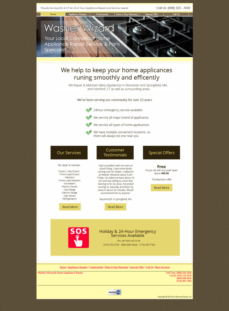
After updating the design, we feel that when visitors lands on this webpage, they will immediately see a very focused message of how the website (and therefore the company) can help them. This message existed in the the old design, but it was just very cluttered and buried within too many details.
The visitors will also easily and quickly see “why” they should choose this company to repair their broken appliance(s).
There are also very obvious paths leading visitors to get more information. The 3 individual blocks in the middle of the page are clear navigation paths and “next steps”.
The site is now very clean, professional looking, and easy on the eyes. The chances of the visitor getting confused, frustrated and leaving is much lower after this re-design!
By employing some of the techniques and best practices above, any one can make their websites look much more professional!